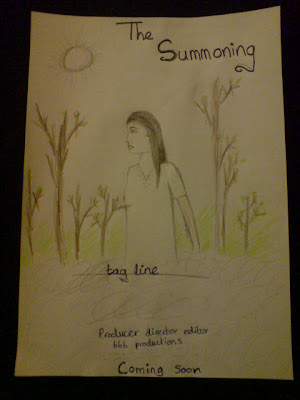
i like this as a rough idea for the poster, this is because we have a lot of photos that can help us create a poster like this, it consists of having the main character in the middle of the poster, as done by many other real posters for example Friday The 13th. in the draft you can see that i have also added mist, this is used a lot in horror posters, as it represents something mysterious and the unknown, this is how i want the poster to look, mysterious. the poster will also have the directors name, producers name, actors name and the production name at the bottom of the poster, this is very common in horror posters. however, this draft posters title is at the top instead of being at the bottom which is the case in most horror posters. this is becuase at the moment it is unsure were we might put the title, but we are goign to play around with where the title looks the best.

No comments:
Post a Comment