The Summoning (my Evaluation!)

Poster and Magazine

http://www.vuvox.com/collage/detail/021164850c

Tuesday 9 March 2010

Final Magazine Front Cover


this is the final! and we have used a lot of conventions and we have also challenged some.
used:


  • bar code

  • masthead

  • date/price

  • website

  • plug/puff

  • cover lines

and we have challenged


  • tag line - it is linked to the magazine also movie

  • new actress being introduced

it is not common to introduce a new actress on the magazine front page, however we challenged this and introduced a new actress.


as you can see the colours are the same as the ones used in the poster and teaser. it was important to use the same colours.


when we did our premier we made our invitations and they looked like this:

we put thumb prints on the invitations, to make it look cool and effective and scary, to add to the horror genre! this was quiet fun! my thumb prints were very good =]. any way on the invitations we used words that linked to our film. so we wrote you have been summoned, this we thought was perfect!!! and we were very excited.

a lot of people came to view our trailer, and see the posters and magazine front cover, and we got a lot of feed back mostly all positive.

there was about 1 or 2 negative feed back, however most people said that they loved it.

all my feedback is in my evaluation. you can have a look at that. prezi was something new to me but it was very exciting. i have never used it before and that is the exciting part, i love to play around with things my self, although there was a video you watch before using it, i didnt watch it as i just wanted to get into it and try everything and experiment myself.

The Final Poster!!

this is the completed poster! i am very happy with the poster!
mist has been used, this represents mysteriousness, it shows the unknown! weve used the same colours in the poster and the magazine front cover, the colours are Red, Black, and White. these are the main colours , these colours have been used through out our teaser trailer so it is right that we use it in the poster and magazine.

i have analysed otehr posters and have used some conventions of horror posters, however we have challenged a lot of things for example almost all of the horror posters are dark and our one is very bright and light as i said in the teaser the light is usd becuase it is challenging a convention of the horror genre, as people feel safe during the day so we are making them feel scared in their own comfort zone.

we have used the same font in the poster, teaser and magazine , the font for the movie name is the same it is called open classic it is important to use the same because it is an important link between the the products.

we have used the main things in the poster the name, tagline, production name, director, producer, website. however we do not have a proper date this is because the teaser says coming soon and does not have a date so it would not make sense if the poster had a date. and it is a link in between the two.

Wednesday 24 February 2010

The Summoning Teaser Trailer

i have added the teaser trailer here on the blog, if you look on the right side of my blog you can see that i also have the teaser trailer from youtube on it so it can be accessed quickly, instead of trying to find it from all the postings.

As you can see unlike other Horror teaser trailers or even trailers, ours is mostly set in day light! you must be thinking WHY??!!

well the reason this has been done is because people are not scared of the day! it their comfort zone, people stay in during the night because they feel unsafe around the time as it is dark! but we challenged this convention of setting in the DARK to make it day time so people feel scared and can say "omg things like this can happen during the day!" so yes we have challenged a convention and for a good reason too! =]

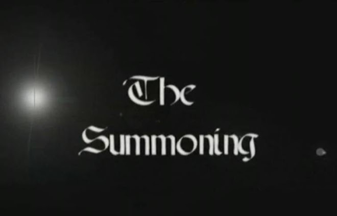
as you can see the music we have used is orchestral church music, this was done due to the fact that we have so much religious symbols and meaning and usage in our teaser that it just fits in perfectly! also as we have used the olden type biblical writing for the title of the movie that its perfect! it creates the exact affect that we wanted, we have put the right notes, high sounds and scary parts of the music in the right places of the teaser so that it fits nicely and is not out of place.

we speeded up some of the durations and added effects all on photoshop premier pro. this i must say i have never used before! EVER! so it was a new experience for me, i must say i did enjoy it and i learnt it quite quickly! i also learned a lot of short cuts for example c = cut, very exciting!

instead of using a voice over we have used text in our teaser trailer through out in different places: Death, Destruction and Darkness follows. we decided not to use voice overs because there is a lot going on in the trailer and we feel that the music is very important in our trailer and we did not want the a voice over taking the audiences attention.

We used blood in our teaser trailer this is what makes it an 18! we used blood because it is one of the conventions of horror, a lot of horror films use it, as it represents death, and death is a scary thought!

we used a knife as well! that is used in films such as Halloween (1976), a weapon is a convention of the horror genre and its mostly a knife, this is something that is found in every household.

we tried to use the Final girl theory but we challenged it and subverted it a bit, the final girls in other horror movies have androgynous names, wear baggy dark clothes, hair in pony tails and are innocent. however we challenged this convention, the final girl in our horror movie has a name that is Elizabeth, this name is a very olden time name, she is a murderer although it is her mother that kills people it is still her body and that is how we have challeneged it so much! our final girl is very innocent as she does not know what is happening to her.

we used a lot of conventions for camera shots and angles, and we challeneged it =] this is by using the dolly shot which no horror teaser trailer actually use because it takes long, however we used it and then we speeded up the duration.

over all we are happy with our teaser trailer, and our feedback showed that the audience enjoyed it very much too! we got a lot of positive feedback, as you can see on my evaluation

one negative feedback was that there was too much in the woods, looking at our trailer after i also think that this comment is true, if we are given the chance to change anything we would have less, probably add a different scene or change the way it is set.

WE are definetly happy with it and i really enjoyed making it and i learned a lot! very much!

Tuesday 23 February 2010

The main picture used

this is the main picture we used:

Begining the process of creating the poster

Firstly we had to sort out whether we were going to use a picture that we had already taken whilst filming or if we were going to take new pictures.
we went trough all the pictures that we have taken and we took out quite a lot of pictures that we really liked and thought would work well with our poster. we went through them all it felt like we were auditioning for the best one. once we picked out the best picture then the creatign could start. the picture that picked out has perfect lighting that we may not be able to get if we tried to take another picture like that one again. this is because the light is directly above of the main character. the picture is of the main character in the woods, we chose this becuase it uses quite a lot of horror conventions, for example isolation, and final girl/victim/monster.

Final chosen draft for the poster.


i like this as a rough idea for the poster, this is because we have a lot of photos that can help us create a poster like this, it consists of having the main character in the middle of the poster, as done by many other real posters for example Friday The 13th. in the draft you can see that i have also added mist, this is used a lot in horror posters, as it represents something mysterious and the unknown, this is how i want the poster to look, mysterious. the poster will also have the directors name, producers name, actors name and the production name at the bottom of the poster, this is very common in horror posters. however, this draft posters title is at the top instead of being at the bottom which is the case in most horror posters. this is becuase at the moment it is unsure were we might put the title, but we are goign to play around with where the title looks the best.

Draft ideas for the poster.